
In the first session, all of our booklets were checked, and were suggested some changes.
Later, we were taught a few techniques in Illustrator and InDesign.
Illustrator
Appearance :-
- Make sure you make a new layer before starting anything.
- Write a text – IMAGING CLASS.
- Open Appearance window.
Window -> Appearance.- Select the text you’ve written, and turn the fill to none (from the appearance window)
This is important, otherwise it doesn’t recognise the colour that we are going to use. in the next step.- Add new fill -> Add a new colour, say black.
- Add a new fill again, say yellow.
Since this is the second. layer of fill, it will not be visible in the beginning.
- Add new effect
- Distort and transform
- Transform
- Copies – Copies of effect added (shadow) – set it to 100 or 150.
- Move – Distance between 2 copies – Set it not more than 0.5.
- Select the text you’ve written, and turn the fill to none (from the appearance window)

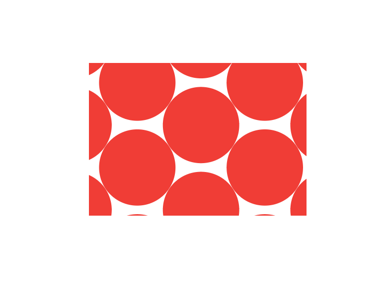
Patterns :-
- Draw a square and a circle. Turn the fill of square to none, and that of the circle to a colour, say red.
- Align both of them, circle being at the centre of the square.
- Select them, go to swatches -> drag the selected part and drop it in the swatches panel. (This becomes a repeated pattern now.
Now, any shape, or text you make, you can always put this pattern on it.
For text -> go to Appearance -> new fill -> swatch. - You can also change the swatch/pattern later.
Select the rectangle/text that has the pattern you want to change -> Double-click the swatch from panel -> make changes.

Graphic Styles :-
We can also replicate a pattern from one text/shape to another text/shape.
- Write a text – TEST.
Clean it -> Fill to none.
Create new fill, say black. - Go to Graphic Styles
Click on the text with the pattern you want to replicate, and then click “New Graphic Style” icon, from the graphic style panel. - Now you can replicate the pattern from the panel to the text “Test”.
Basic Functions of Layer Panel :-
Eye icon - You can make the layer disappear(hide it), if you don't want it for a period of time.
Lock icon - You can lock a layer, if you don't want it to move.
Small circle icon (at right) - Selects that particular layer.
You can also combine layers by dragging them.
You can also replicate some pattern by drawing one layer to another.
Text Wrap :-
- Text box
- Any shape.
- click both of them
- Object -> text wrap -> text wrap options
- Object -> text wrap -> make.
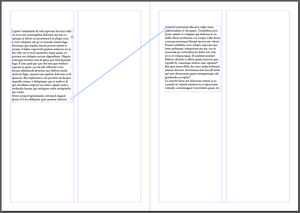
InDesign
- Make the columns – 2
- Placeholder text
- alt + ‘+’
- click on the next part of page
- copy the place holder text on column 2
- View -> extras -> show text threads.
This shows the continuation of text from one column to another.
Reflection – It was interesting how we can replicate the patterns in different ways – through graphic styles, or through layers. I learnt how Appearance panel works, all its icons made me learn a new concept. Moreover, I think the text threads are really helpful and efficient to work with, as every booklet requires a continuation if text, and a proper structure too.
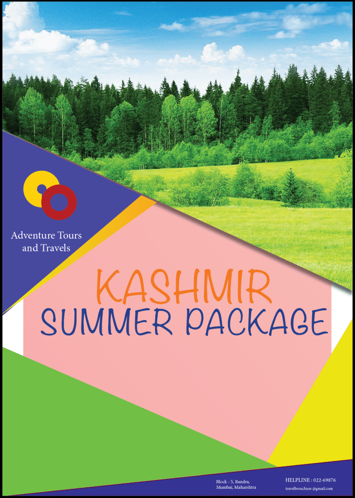
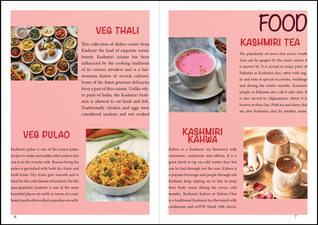
I thought of designing a travel brochure for Kashmir, because it is one of my favourite places. But even more major reason is that most of the people I know, have not visited this place yet. I feel everything in this place is an embracement in itself. Thus, this brochure is to cherish and admire this beautiful place.
The font that I’ve chosen for headers or for the paragraph text I think goes well the image I had in my mind for this booklet.
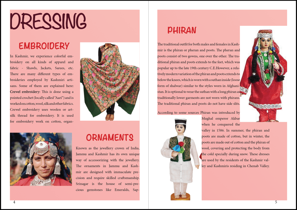
This booklet is to cherish the place, and pink is the colour that symbolises admiration. Hence, I’ve chosen Pink as my background colour.
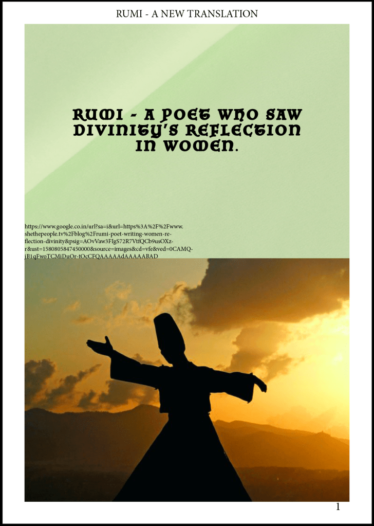
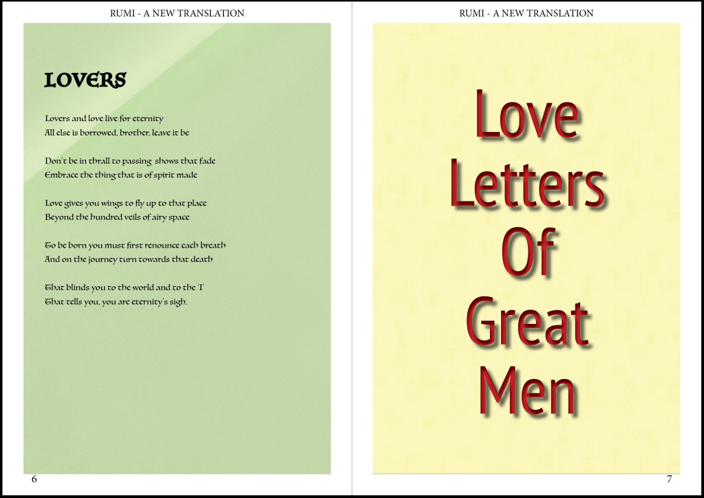
Rumi is great poet I've known till date. His poems are most of the times based on love of women and love for women. I'm not so fond of reading, but his poems never bored me, which is why I decided to collect my favourite poems of his and make a booklet.
The font that I've used is I think best suits the content.
Rumi's poems calm me in some sense. Hence, I've used Green as my background, that symbolises Calmness.
